Physical Address
W Sunrise St, Bisbee, Arizona 85603
Physical Address
W Sunrise St, Bisbee, Arizona 85603

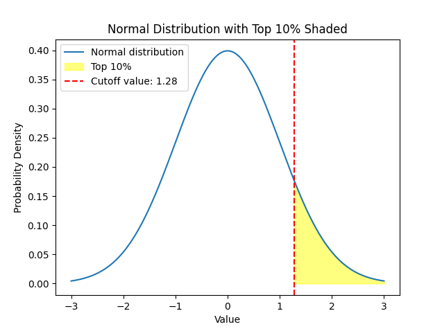
Creating a graph of a normal distribution with the top 10% shaded in yellow is a great way to visualize statistical data.
Here’s how you can do it:
Python code snippet that uses the matplotlib and scipy libraries to generate such a graph.
import numpy as np
import matplotlib.pyplot as plt
from scipy.stats import norm

# Define the range and density of the x-axis
x = np.linspace(-3, 3, 1000)

# The normal distribution
y = norm.pdf(x)

# Calculate the value that cuts off the top 10%
cutoff = norm.ppf(0.9)

# Plot the normal distribution
plt.plot(x, y, label='Normal distribution')

# Fill the top 10% of the distribution
plt.fill_between(x, y, where=(x > cutoff), color='yellow', alpha=0.5, label='Top 10%')

# Add a line for the cutoff
plt.axvline(x=cutoff, color='red', linestyle='dashed', label=f'Cutoff value: {cutoff:.2f}')

# Add labels and title
plt.xlabel('Value')
plt.ylabel('Probability Density')
plt.title('Normal Distribution with Top 10% Shaded')

# Show legend
plt.legend()

# Display the plot
plt.show()
To run this code, you’ll need to have Python installed on your computer along with the matplotlib and scipy libraries. You can install these libraries using pip if you don’t have them already:
pip install matplotlib scipy
After running the code, you’ll see a graph of the normal distribution with the top 10% shaded in yellow. The red dashed line represents the cutoff value beyond which the top 10% of the distribution lies. Remember, the actual values will depend on the mean and standard deviation of your specific distribution. The code above assumes a standard normal distribution centered around 0 with a standard deviation of 1.